
The 905 offers more torque in expansions, but that extra return arrives with higher volatility, deeper drawdowns and much wider local outcomes than the headline average suggests.
Key judgment
- Capital is not simply leaving Toronto for the suburbs. The reality is that transaction activity is recovering faster in 905 low rise housing, while 416 prices are proving more resilient.
- Across the aggregate series from 1996 to 2025, the 905 delivered slightly higher annualized price growth than the 416, at 6.1% versus 5.8%. It also carried 6.8% annual volatility versus 4.2% in the 416 and experienced twice the recent drawdown.
- The aggregate 905 return edge is mostly due to mix, not necessarily due to a geographical premium. Holding product constant, the 905 outgrew the 416 only in townhouses, at 6.4% versus 6.2%, and lagged modestly in the other three categories, while its annual volatility was higher in every one of the four.
- Municipality data from 2011 to 2025 show that dispersion survives complete cycles. The rational portfolio mix is a core 416 allocation with selective, suburb by suburb exposure in the 905.
1. The aggregate data favour the 905, until mix and risk are included
We constructed a monthly series of 366 observations from TRREB Market Watch data covering January 1996 through June 2026. To reduce monthly composition noise, we aggregated sales and dollar volume into annual average transaction prices. In this analysis, the 416 means the City of Toronto and the 905 is shorthand for the surrounding TRREB market area.
The 905 average rose from approximately $189,000 in 1996 to $1.063 million in 2025, equivalent to 6.1% annualized growth. The 416 moved from roughly $210,000 to $1.077 million, or 5.8% per year.
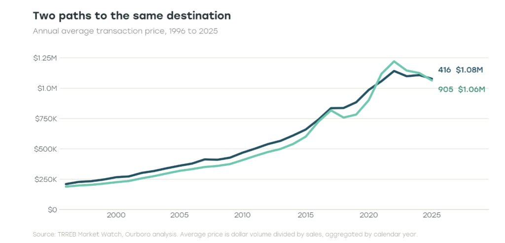
Overall, 416 and 905 experienced different curves, but ended up at roughly the same spot (current prices), with 905 edging out slightly on a CAGR basis.
Was the 905’s higher aggregate growth really driven by geography? On a like-for-like basis from 1996 to 2025, 905 versus 416 annualized growth was 6.3% versus 6.4% for detached homes, 6.4% versus 6.6% for semi-detached, 6.4% versus 6.2% for townhouses and 5.7% versus 5.8% for condominium apartments. The aggregate CAGR edge of the 905 therefore came mostly from the mix of homes transacted rather than a broad same property geography premium; only townhouse growth was higher outside the city. Overall, returns across the 416 and 905 were broadly comparable, with the primary differences appearing in risk.
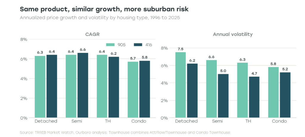
The risk pattern was even more consistent: 905 annual price volatility was higher in all four property categories, ranging from 5.8% to 7.5% versus 4.7% to 6.2% in the 416. During the expansion from 2019 to 2022, semi-detached homes rose 56.1% in the 905 versus 31.0% in the 416, the widest same-type premium. During the correction from 2022 to 2025, the largest relative giveback also appeared in semi-detached homes: 15.1% down in the 905 versus 9.6% in the 416. The aggregate 905 beta therefore reflects both its low rise mix and greater cyclicality within the same housing type.
Annual price volatility was 6.8% in the 905, compared with 4.2% in the 416. The 905 produced roughly 0.90 units of compound return for every unit of volatility, while the 416 produced 1.38. Put simply, the 905 generated slightly more return, but the 416 delivered more return per unit of risk.
2. The two markets are correlated, but the 905 amplifies the cycle
Annual returns across the 416 and 905 were highly correlated (0.80), reflecting the fact that both markets are driven by the same underlying forces, including mortgage rates, employment, and buyer confidence. In other words, the 416 and 905 do not behave like two independent housing markets.
The difference is sensitivity. Over the full period the 905 had a beta of approximately 1.30 to the 416. When the GTA cycle accelerated, the suburbs generally moved further. When it reversed, they fell harder. In other words, higher risk, higher return.
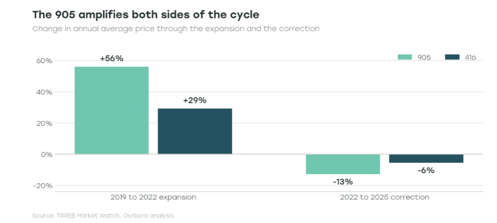
Between 2019 and 2022 the annual average price increased 56% in the 905, compared with 29% in the 416. From 2022 through 2025 the 905 gave back 12.9%, while the 416 declined 5.6%. On a rolling 12-month basis the 905 was 16.3% below its peak by June 2026. The comparable 416 drawdown was 8.0%.
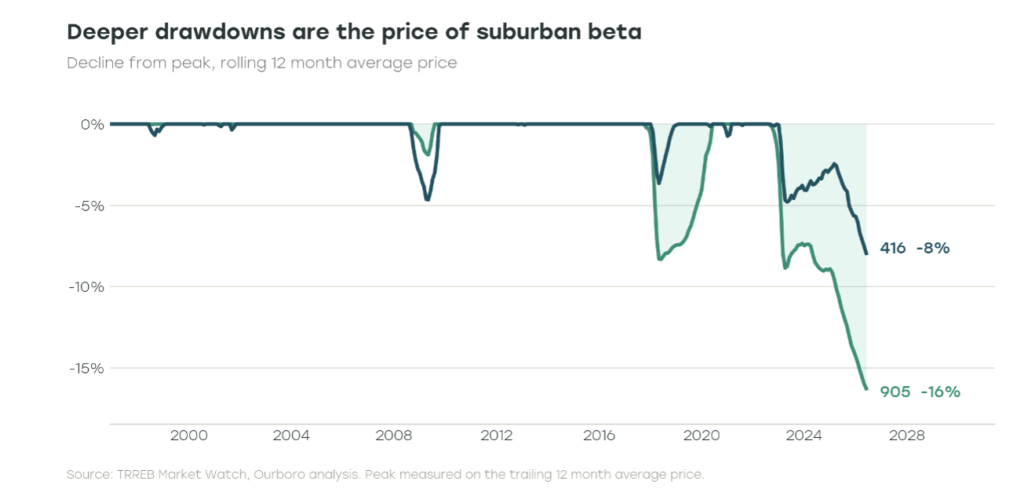
This is not an argument against suburban exposure. It is the price of owning a more cyclical market. The 905 can outperform for meaningful periods, but it requires more tolerance for timing risk and larger interim losses.
3. The pandemic reduced the cost of distance
The pandemic did not create the shift toward the 905, but it clearly accelerated it. As remote work became more common, many buyers gained the flexibility to live farther from downtown. Statistics Canada found that the share of employed Canadians working primarily from home rose from 7.1% in 2016 to 24.3% in 2021. Although that fell to 18.7% by 2024, it remained more than double its pre-pandemic level.
Bank of Canada research illustrates what that did to location pricing. A comparable home 50 kilometres from downtown sold at an estimated 26% discount in 2019. The trend in place before the pandemic implied a discount of about 21% in 2021; the observed discount was only 10%. Buyers were paying materially less of a penalty for distance.
Our TRREB series shows the same shift in transaction value. The market outside the 416 represented 60.5% of TRREB dollar volume in 2019 and 65.5% in 2021. For the 12 months ending June 2026 that share had declined to 62.7%, still above 2019 but well below the pandemic peak.
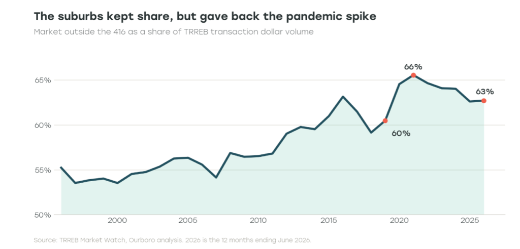
That distinction matters. Some capital moved outward because remote work, low rates and demand for space changed the economics of commuting. Part of that move has since reversed. What remains is a higher suburban allocation, not proof of a permanent one way migration.
4. The current shift is appearing in sales before prices
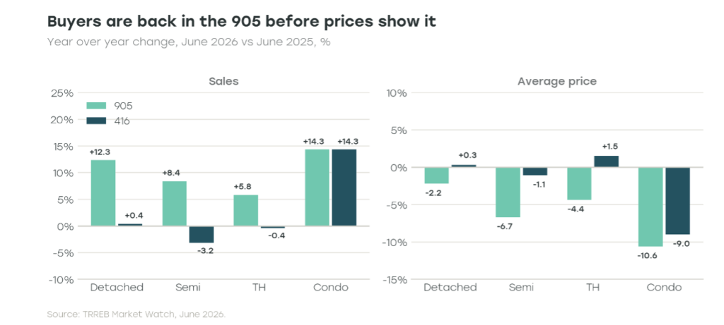
June 2026 produced the clearest evidence that buyers are returning to 905 family housing first. Detached sales increased 12.3% year over year in the 905, compared with 0.4% in the 416. Semi-detached sales rose 8.4% in the 905 and declined 3.2% in Toronto. Townhouse sales increased 5.8% in the 905 and slipped 0.4% in the 416.
Prices told the opposite story. The average detached price fell 2.2% in the 905 and increased 0.3% in the 416. Semi-detached prices declined 6.7% versus 1.1%, while townhouse prices fell 4.4% in the 905 and rose 1.5% in Toronto. Condominium apartments were liquid but not yet resilient. June sales increased 14.3% year over year in both geographies, while average prices fell 9.0% in the 416 and 10.6% in the 905. The fact that condo prices fell by a similar amount in both regions reinforces an important point: differences between the 416 and 905 are often driven by property mix rather than geography itself.
The attraction is visible in the entry price. A 905 detached home averaged $1.273 million in June, approximately $376,000 below the 416 average. A 905 townhouse averaged $808,000, about $165,000 less than its Toronto counterpart.
Buyers appear to be returning to more affordable suburban low-rise homes, but prices have yet to fully respond. Sales activity is picking up before prices, suggesting the market may be in the early stages of a recovery rather than a full rebound.
5. The 905 is not one market
Treating the 905 as one market misses what is actually happening on the ground. Conditions vary meaningfully across the region. In June, the average home price ranged from $856,000 in Durham to $1.22 million in Halton, while benchmark prices fell 4.1% in Halton but 7.3% in York.
Population trends tell a similar story. Durham continued to attract residents, growing 2.15% over the past year, while both Toronto and Peel saw their populations decline. Where people are moving, and how much housing is available, differs from one region to the next.
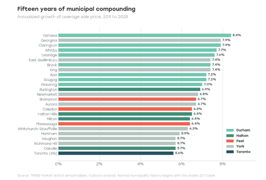
Those differences have been consistent over time. Durham delivered the strongest long-term price growth, but it also experienced much larger swings than Toronto. During the pandemic it rose much more quickly, and it gave back more as the market cooled. Higher returns often came with higher volatility.
The same pattern appears at the municipal level. Oshawa was one of the strongest long-term performers, while Brampton and Caledon saw some of the largest pullbacks after the pandemic. Oakville, by contrast, experienced a milder correction and has already begun to stabilize.
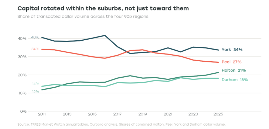
Capital also rotated within the 905. Halton’s share of transacted value across the four surrounding regions rose from 11.8% in 2011 to 21.3% in 2025, and Durham’s rose from 13.7% to 18.1%. Peel declined from 34.0% to 26.9% and York from 40.5% to 33.6%. The shift was not just from the 416 to the 905. It was also a reshuffling within the 905 itself.
Housing mix adds another complication. In the 2021 Census, 23% of the occupied dwellings in Toronto were detached homes and 47% were apartments in buildings of five storeys or more. In Durham the comparable shares were 66% and 7%. Part of what looks like geography is therefore a comparison of asset classes, urban condominiums against suburban low rise housing.
6. Dispersion is the real difference between the two markets
Housing type also plays an important role. Toronto and the surrounding regions simply have very different housing mixes. In the 2021 Census, only 23% of occupied homes in Toronto were detached, compared with 66% in Durham. At the same time, 47% of Toronto homes were apartments in buildings of five storeys or more, versus just 7% in Durham. As a result, some of what appears to be a difference between the 416 and 905 is really a comparison between condominiums and low-rise homes.
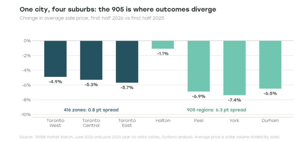
A city-wide position in the 416 behaves much more like a single market. The 905 is different. It is a collection of distinct local markets, each with its own pricing, supply, and demand dynamics. Treating it as one market hides much of what actually drives performance.
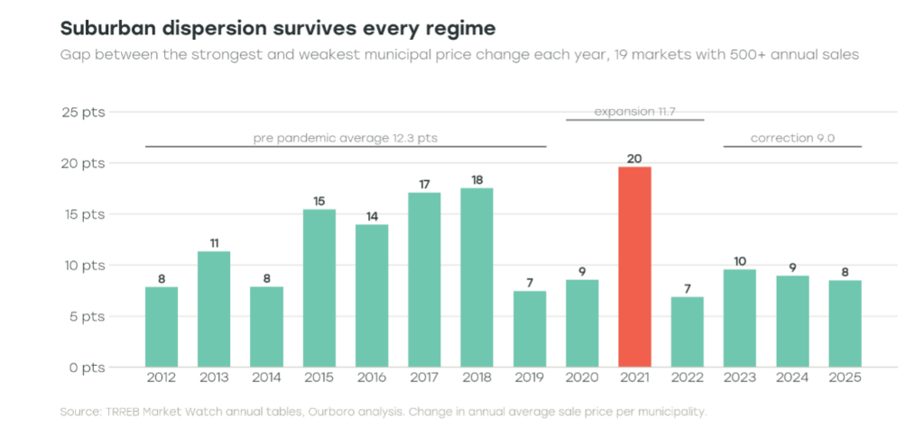
That pattern has been remarkably consistent over time. Even as the market moved through the pandemic boom and subsequent correction, meaningful differences remained between municipalities. Some areas consistently outperformed while others lagged, and the gap between the strongest and weakest markets remained wide. The correction narrowed those differences, but it did not eliminate them. The 905 has continued to behave as a collection of local markets rather than a single, unified one.
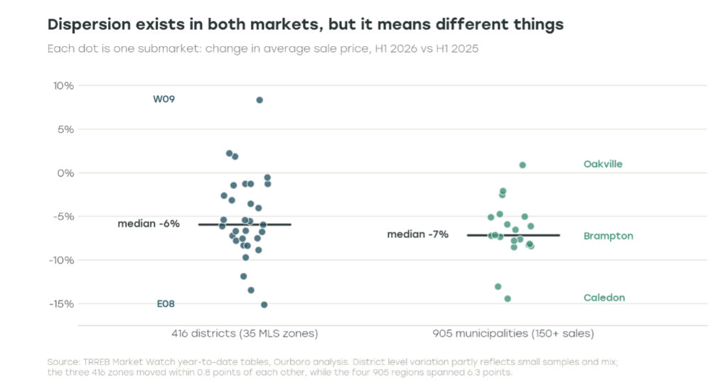
The differences are even more noticeable at the municipal level. In the first half of the year, prices rose 0.9% in Oakville but fell 14.4% in Caledon, a gap of more than 15 percentage points. These are not niche markets either. Oakville recorded about 1,300 sales and Brampton nearly 2,300. It is a reminder that the 905 is made up of very different housing markets, each following its own path.
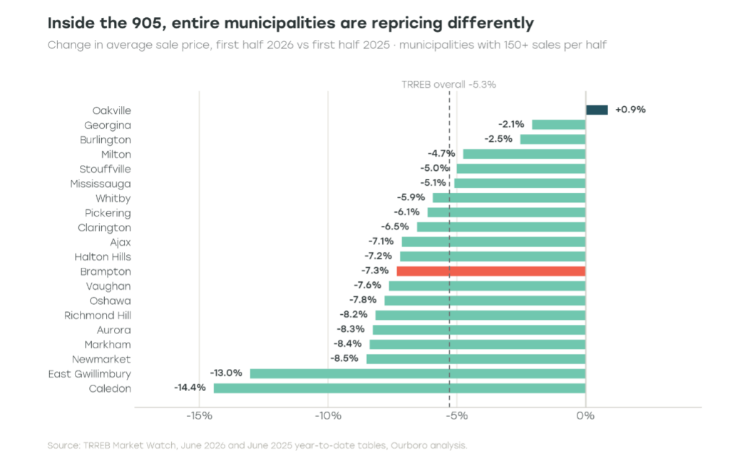
Brampton and Oakville show just how different the 905 can be. In the first half of the year, Brampton’s average price fell 7.3%, while Oakville’s rose 0.9%. Peel was also the only major 905 region to lose population over the past year, while Halton continued to grow. Despite being part of the same suburban market, the two regions are moving in very different directions.
Toronto also has differences between neighbourhoods, but they are much less pronounced once the data are grouped together. Across the city’s 35 MLS districts, prices ranged from down 15.1% to up 8.3%, much of which reflects differences in the types of homes that sold. At the broader city level, those differences largely disappear. In the 905, they do not. The variation is still visible across entire municipalities, benchmark prices, and population trends, suggesting these are real differences between local markets rather than statistical noise.
Looking across property types tells a similar story. In the 905, price changes varied meaningfully even within low rise housing. Detached homes were down 2.2% in June, while semis fell 6.7%. In the 416, low rise homes all performed much more similarly. Condominiums were the exception, with prices falling in both markets, down 10.6% in the 905 and 9.0% in the 416.
For investors, the takeaway is simple. It is not enough to have exposure to the 905. Outcomes depend on which part of the 905 and which type of housing you own. Over the past year, that difference has mattered far more than the headline performance of the suburban market.
7. What could interrupt the rotation
There are three main risks to the 905 thesis.
The first is mortgage renewals. Lower interest rates help, but many homeowners are still rolling off the ultra low fixed rates they locked in during the pandemic. The Bank of Canada estimates that roughly 12% of outstanding mortgages will renew over the next year, with payments rising by about 15% on average. That could continue to weigh on demand, particularly among more price sensitive households.
The second is remote work. Working from home is still much more common than it was before the pandemic, but it has been gradually declining. If commuting becomes a bigger part of daily life again, some of the advantage enjoyed by outer suburban markets could fade, benefiting the 416 and the best connected parts of the 905.
The third is the broader demand backdrop. Population growth across the Toronto region slowed sharply over the past year, while housing inventory remains elevated. That combination could make any recovery slower and more uneven than many expect.
The broader takeaway is straightforward. There is opportunity in the 905, but the market is far from uniform. Some areas have stronger fundamentals than others, and those differences are likely to matter as the next phase of the housing cycle unfolds.
Conclusion: anchor in the 416, select in the 905
The 416 and the 905 are closely connected, but they offer different investment profiles. Over the long run, Toronto delivered a steadier ride with more consistent performance across the city. The 905 produced slightly higher appreciation and stronger upcycles, but those gains came with larger drawdowns and more volatility. Looking beneath the headline numbers also changes the picture. Most of the long term return difference disappeared when comparable housing types were matched, while the higher volatility in the 905 remained. The bigger story is not simply higher returns, but greater dispersion across municipalities and property types.
That has clear implications for portfolio construction. The 416 works well as a core holding because it behaves more like a single market. The 905 is different. Each municipality has its own cycle, so broad suburban exposure is much less informative than understanding where demand, affordability, and population growth are strongest. History shows that markets such as Durham have rewarded investors over time, but it also shows how quickly conditions can change after a strong run.
Ultimately, this is where active allocation matters. The goal is not to own more of the 905, but to own the right parts of it. Position sizes should reflect the differences in risk across municipalities and property types. Some markets deserve larger allocations, others smaller ones, and some are best avoided until fundamentals improve.
Methodology note: The source collection is a thirty year archive of 366 monthly TRREB Market Watch reports from January 1996 through June 2026; annual return statistics end in 2025. Aggregate and property type annual average prices equal summed dollar volume divided by summed sales. Through June 2011, property type dollar volume is reconstructed by multiplying published district sales by rounded district and type average prices; from July 2011, exact published All Areas and City of Toronto sales and dollar volume are used, with the 905 calculated as the difference. The 2011 annual result is therefore a transition year blend. Annual volatility is the sample standard deviation of year over year average price changes. Townhouse combines Att/Row/Townhouse and Condo Townhouse. Named municipality history begins with the stable 2011 annual table and runs through 2025; earlier legacy districts are not forced into modern boundaries. The multi cycle dispersion test uses the 19 municipalities with at least 500 sales in every full year. First half 2026 comparisons use the June 2025 and June 2026 year to date tables and retain the screen of 150 sales per half year. Average price is sensitive to mix and is not a repeat sales index; the TRREB service footprint and district definitions also evolved over three decades. Capital means transacted residential dollar volume and activity, not observed net investor flows.
References
- Toronto Regional Real Estate Board, Market Watch archive, June 2026 Market Watch
- Toronto Regional Real Estate Board, June 2025 Market Watch
- Bank of Canada, Analyzing the house price boom in the suburbs of Canada’s major cities during the pandemic
- Bank of Canada, Financial Stability Report 2026, Households
- Statistics Canada, Working from home and commuting in Canada
- Statistics Canada, Annual demographic estimates, subprovincial areas, July 1, 2025
- Statistics Canada, 2021 Census Profile